DANIEL ROTH
The Daniel Roth Extra Plat Platinum
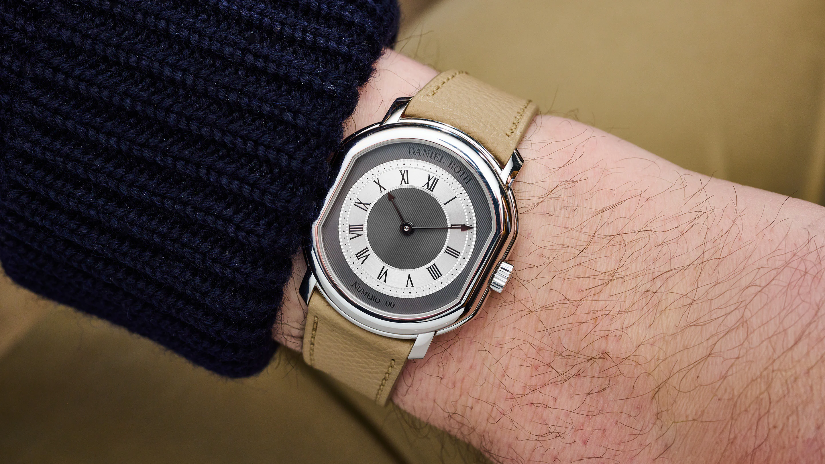
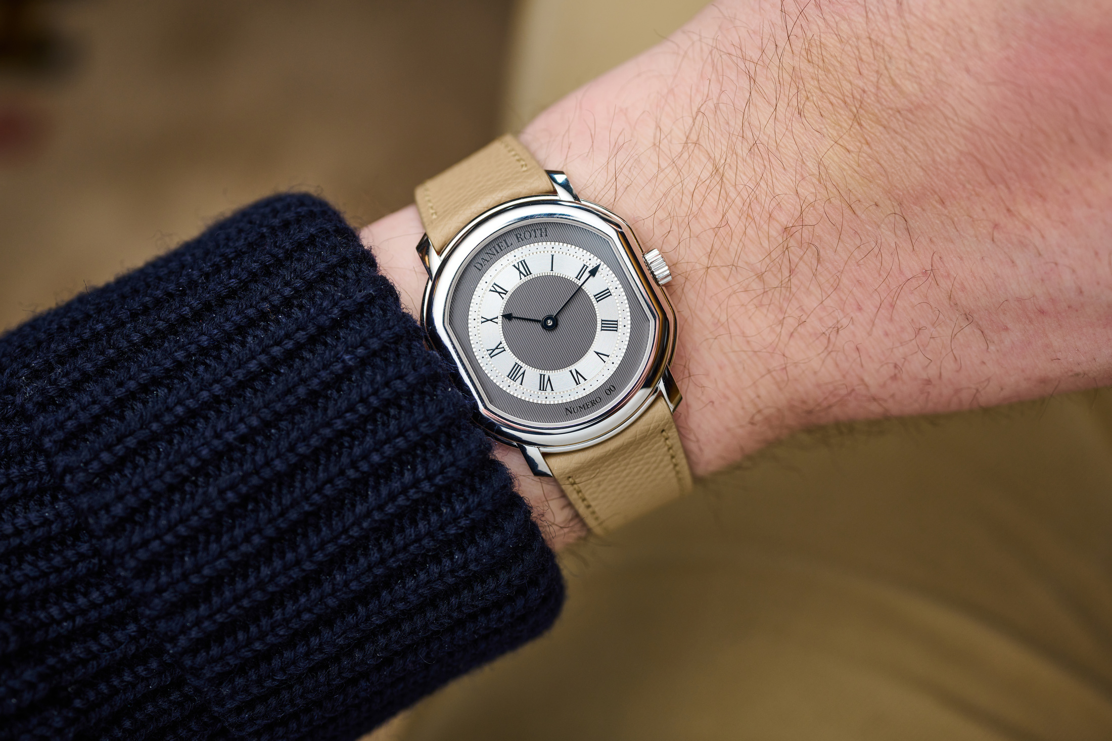
There's just something about the Daniel Roth case that makes for an excellent watch. On the wrist, the ellipsocurvex shape sits comfortably between a round dress watch and a tank, and with the Extra-Plat case (extra-flat, in English) and slightly dropped lugs, it has incredible appeal once you put it on. Which makes it especially hard to convey that in text, but I'll try my best with the newest version that launched today, the Extra Plat Platinum model.
I saw the watch a few months ago when the brand also announced the Extra Plat Skeleton, which was impressive in its own way. But I'd been waiting for a white metal Extra Plat since the brand relaunched (even though the price tag was bound to be outside my range).
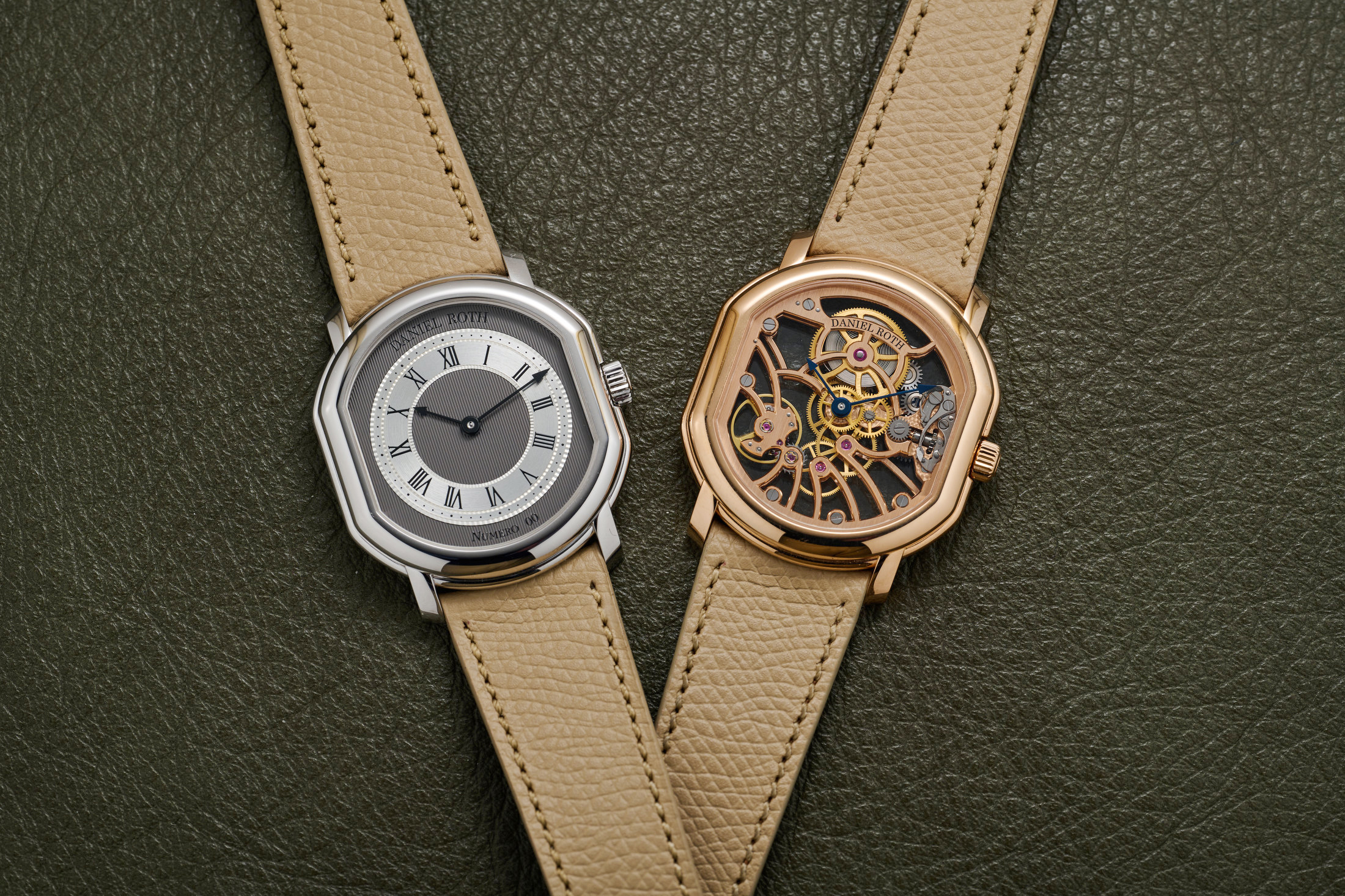
The Extra Plat Souscription was announced only a little over a year ago, and the new platinum version is already the fourth variant in the lineup (yellow gold for the souscription, rose for the next, the rose gold skeleton, and now this). There are only so many ways you can play with the concept, but the details matter even more because of it.
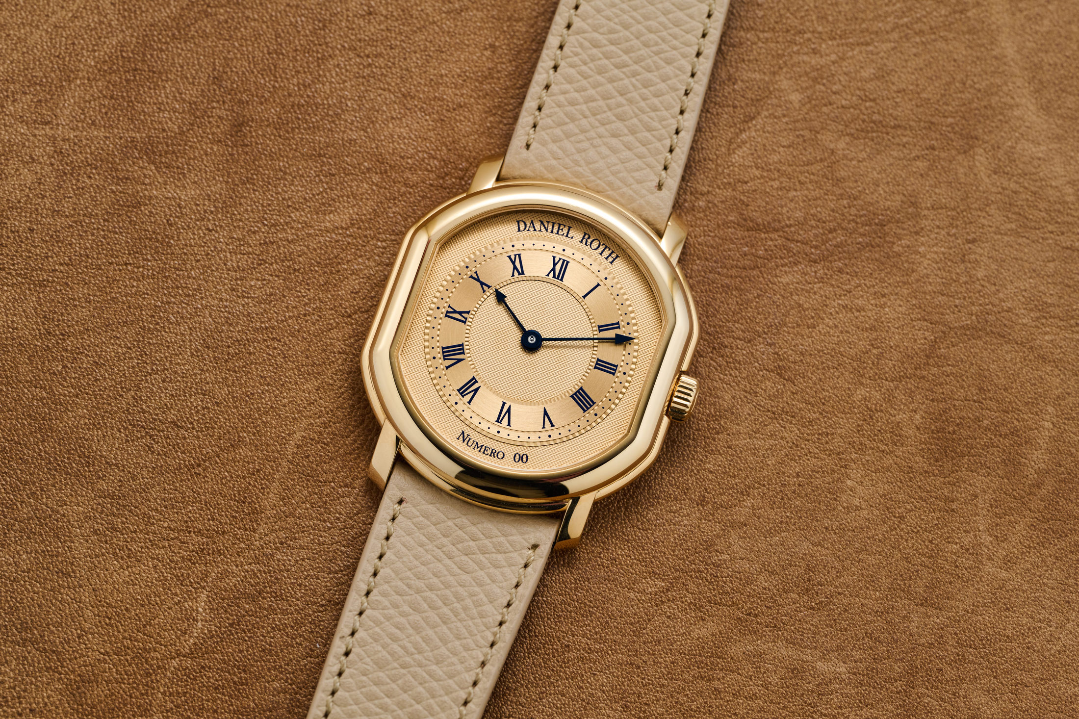
The Souscription, pictured below, had a tonal dial and case with blue printing and hands, a treatment I liked a lot. I actually asked whether the brand planned to take the same approach with the following releases, and the answer, at the time, was no. I think the result is, frankly, a bit more legible. For comparison, I'm showing them all below, and you get a taste of what the front and back look like at the same time.
The new Extra Plat in platinum measures 38.6mm by 35.5mm across the case, but it's hard to convey how it wears. The 35mm side isn't quite right; it's not perfectly 35.5mm around. But 38.6mm lug-to-lug doesn't convey the experience either. Add to that a pretty thin 7.7mm thickness, and it's a very compact watch, yet it carries a lot of presence.
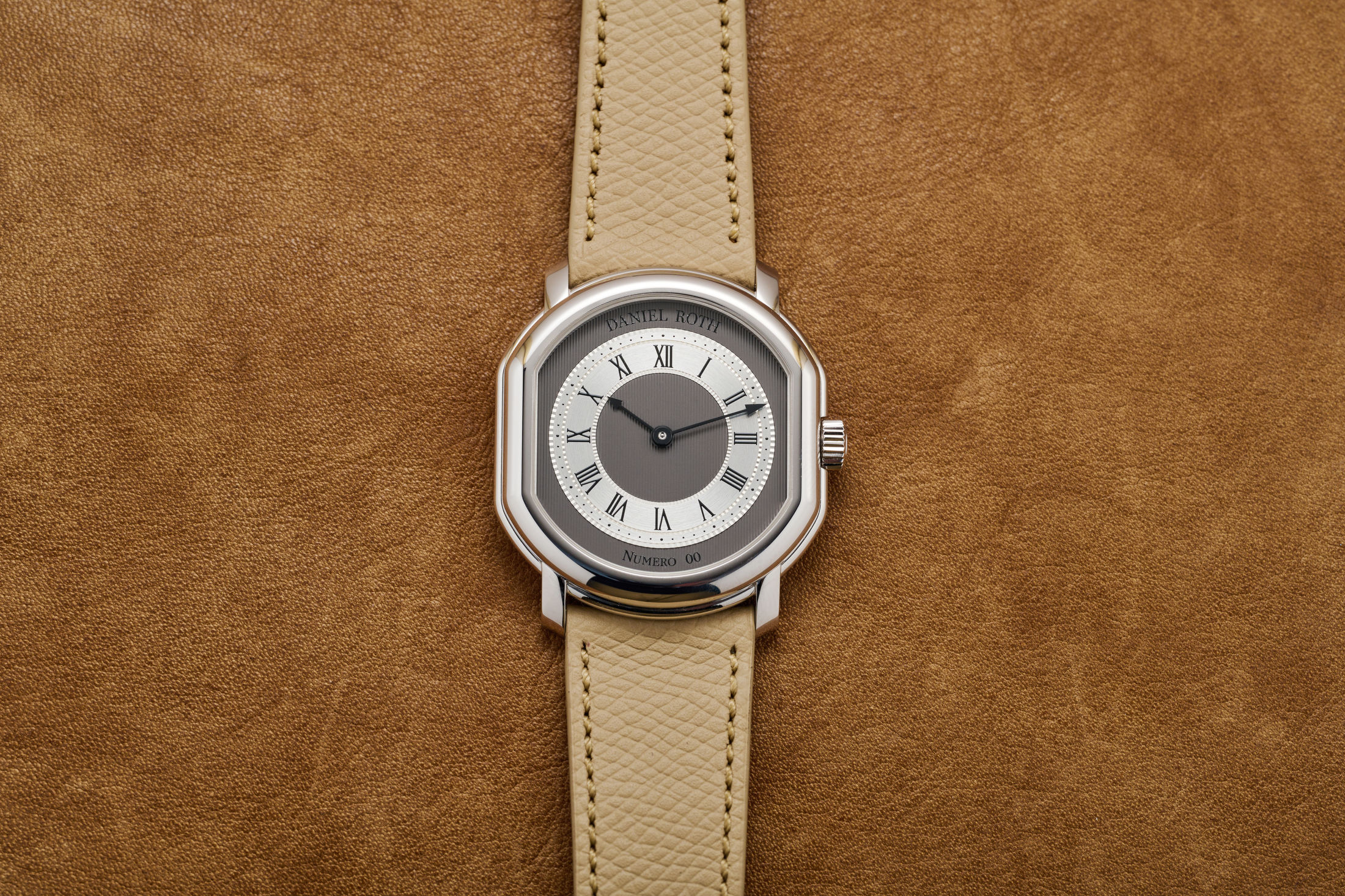
The dial uses a white gold base with pinstriped guilloché, segmented by a white gold minute track with black decalque font. With the black/grey hands made of gold, the contrast is high and legible, but the fonts for the brand name and the production number fade. That, to me, is a good thing. When you've got a recognizable brand and shape, there's no need to overdo the branding.
The movement side is reserved and yet attractive, though I'd argue it's not technically an extra-flat caliber (31mm by 28mm with a 3.1mm thickness). To me, you have to edge under 2.5mm for an automatic movement (like the new Vacheron 2500V) or 2mm for a manual wind. Neo-vintage watches that used a Frederic Piguet cal. 21 movement come in at about 1.75mm. That said, it still is quite a compact movement.
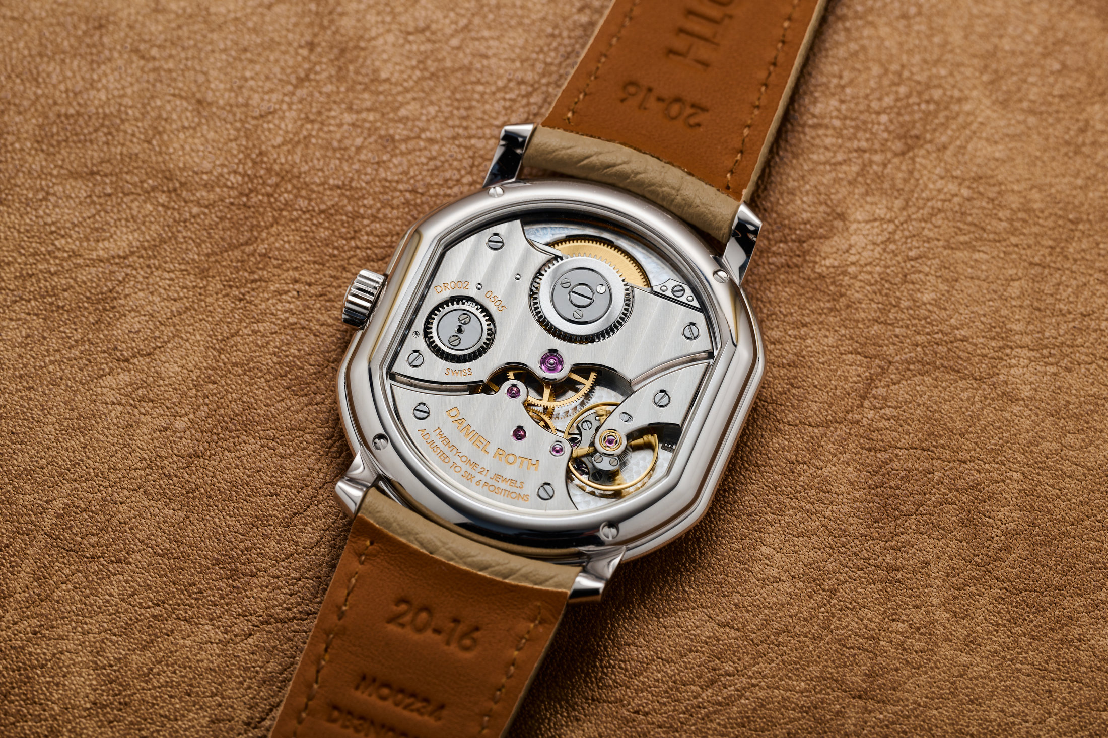
While the Souscription version had a closed caseback, I think the open caseback (as the standard sense) is obviously the right choice. There are a few similarities with the tourbillon architecture, but I like this view much better than its predecessor. The movement was designed by Michel Navas and Enrico Barbasini, the founders of La Fabrique du Temps and talented master watchmakers. You get a 4Hz movement with a 65-hour power reserve, which is much better than the power reserve on many "high horology" offerings these days.
The finishing here is pretty remarkable, though you might lose track of that if you're the type to count interior angles. Instead, think about the shapes that the movement is creating with the limited number of bridges (including the large one that hides the majority of the mainspring barrel, part of the center wheel, and envelops the crown wheel. The curve of the large plate, between the sharp angle following the balance cock and shaped toward the central jewel, mirrors the geometry of the balance itself. The shape of the curve on the other side of the central jewel follows that of the third wheel, but instead of a smooth slope on the bridge holding the third wheel, there's a flourish of a sharp angle before an incut to the area around the jewel itself. Sharp angles where it makes sense and subtle sloping lines elsewhere, not always aligned with the movement, but a kind of call-and-response.
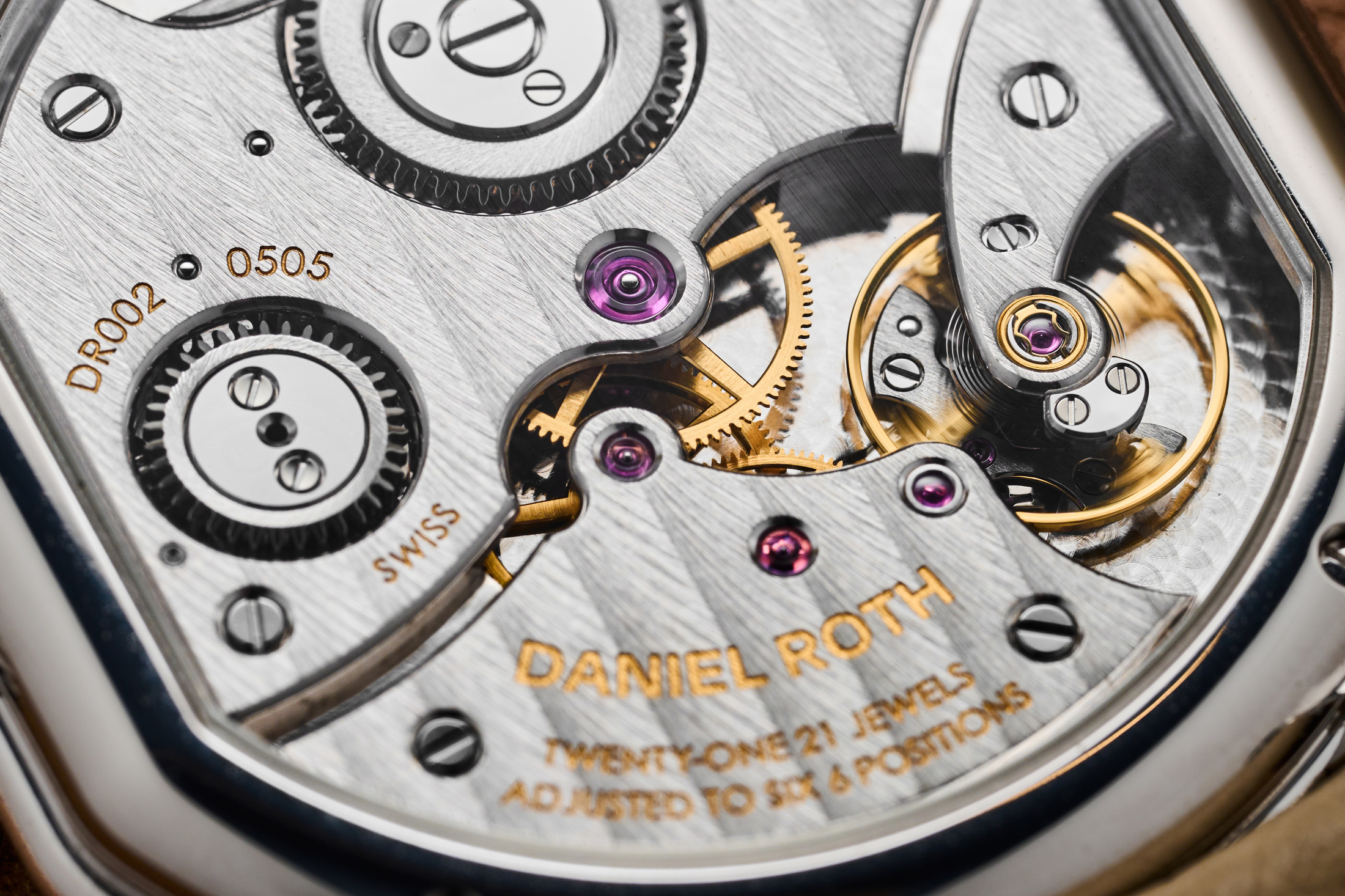
The finishing itself is great as well. Flat sections of the wheels, the screws, and their countersinks (which are beautifully beveled) are all mirror-polished, as is the click spring at the top left, which mirrors the curve of the case (itself mirrored again by the shape of the plate). There's just a level of thought in here that I think will get lost on some collectors who have become accustomed to watches that show how flashy they are.
The question of how it wears is difficult. The long dimension makes some sense, as it shows how it fits on the wrist, so maybe the 38.6mm lug-to-lug length is most representative. Compared to a large Cartier Tank Louis (38.1 mm long), maybe it's like a Tank? But it's a bit wider—35.5mm versus 27.8mm for the Louis. Yet it's not a round watch. And the dial and hands at the center are also much smaller than the overall width. I'd argue that the experience falls somewhere between the two measurements. It's pretty elegant but not too small, yet not nearly as large and bold as something like the Patek 6196P.
The price, on the other hand, comes in above both previously mentioned competitors: CHF 65,000 or about $83,000. That's about $25,000 less than the recently released Skeleton version. This isn't a limited edition, but it is limited in production capacity.
Pricing & Availability:
-Price: CHF 65,000
-Availability: Now
Thebestwatch


Comments
Post a Comment